“Information is what we want, but data are what we’ve got.” - Modern Data Science with R, Chapter 1
“Scientists seek to answer questions using rigorous methods and careful observations. These observations – collected from the likes of field notes, surveys, and experiments – form the backbone of a statistical investigation and are called data. Statistics is the study of how best to collect, analyze, and draw conclusions from data.”” - Introduction to Modern Statistics, Chapter 1
NoteYour turn!
How are you using data analysis in your research?
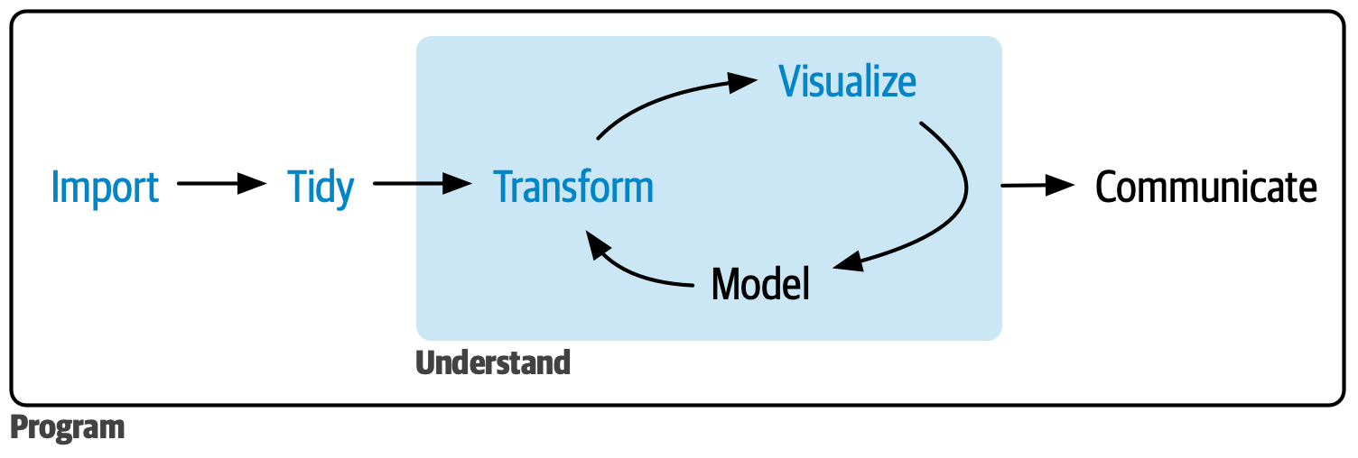
Data analysis workflow
Source: R for Data Science
Data set: North Carolina counties
We will use data about the 100 counties in North Carolina. The data were collected from the from Census Quick Facts and is available in the usdata R package. Let’s look at the first 10 rows of data.
Code
nc_counties |>slice(1:10) |>kable(digits =3)
name
state
pop2000
pop2010
pop2017
pop_change
poverty
homeownership
multi_unit
unemployment_rate
metro
median_edu
per_capita_income
median_hh_income
smoking_ban
Alamance County
North Carolina
130800
151131
162391
5.16
17.6
68.1
17.1
4.30
yes
some_college
25374.90
44281
none
Alexander County
North Carolina
33603
37198
37286
0.53
14.7
79.9
2.2
3.67
yes
hs_diploma
22385.82
44523
none
Alleghany County
North Carolina
10677
11155
11031
1.02
21.0
74.0
6.2
5.16
no
hs_diploma
21280.18
38944
none
Anson County
North Carolina
25275
26948
24991
-3.79
22.7
71.0
4.9
5.31
no
hs_diploma
19798.37
38123
none
Ashe County
North Carolina
24384
27281
26957
0.25
19.4
79.2
4.4
4.18
no
some_college
24350.00
40293
none
Avery County
North Carolina
17167
17797
17536
-0.39
14.7
72.8
18.1
4.35
no
some_college
26362.67
37109
none
Beaufort County
North Carolina
44958
47759
47088
-0.64
19.1
73.4
9.2
5.13
no
some_college
23442.11
41101
NA
Bertie County
North Carolina
19773
21282
19224
-5.53
22.0
76.9
2.2
6.08
no
hs_diploma
19123.28
31287
none
Bladen County
North Carolina
32278
35190
33478
-3.53
24.5
69.0
5.5
5.97
no
hs_diploma
20570.82
32396
none
Brunswick County
North Carolina
73143
107431
130897
13.82
14.1
77.5
9.3
5.66
yes
some_college
29150.66
51164
none
Understanding the data
This is a data frame (like a spreadsheet). It is also an example of tidy data that is ready for analysis. In tidy data
Each row is an observation
Each column is variable (characteristic of the observation)
The table contains one type of observational unit
NoteYour turn!
What do the rows represent in the North Carolina data?
What do the columns represent?
Study designs
It is important to understand data provenance (data origin and history of changes), because it helps us understand the scope of the conclusions that can be drawn from the data. See “Datasheets for Datasets” by Gebru et al. (2021) for more on data provenance and documentation.
A key piece of data provenance is how the data were collected, called the study design. There are two types of study designs: Experimental and Observational.
Experimental study: Researchers (randomly) assign subjects to specific treatments.
Subjects generally the same across treatment groups.
Can make causal claims (e.g., Treatment X causes Y outcome), because the effect of confounding factors is reduced. The only difference between the groups is the treatment that is applied.
Observational study: Researchers do not assign subjects to treatment.
Subjects are likely different across treatment groups
Challenging to make causal claims, because there could be confounding factors that affect subjects’ behavior.
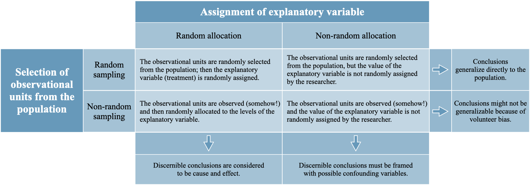
Below is a chart from Introduction to Modern Statistics (Chapter 2) showing how the scope of conclusions relates to the study design.
Source: Introduction to Modern Statistics
NoteYour turn!
What type of study design was used to collect the North Carolina counties data?
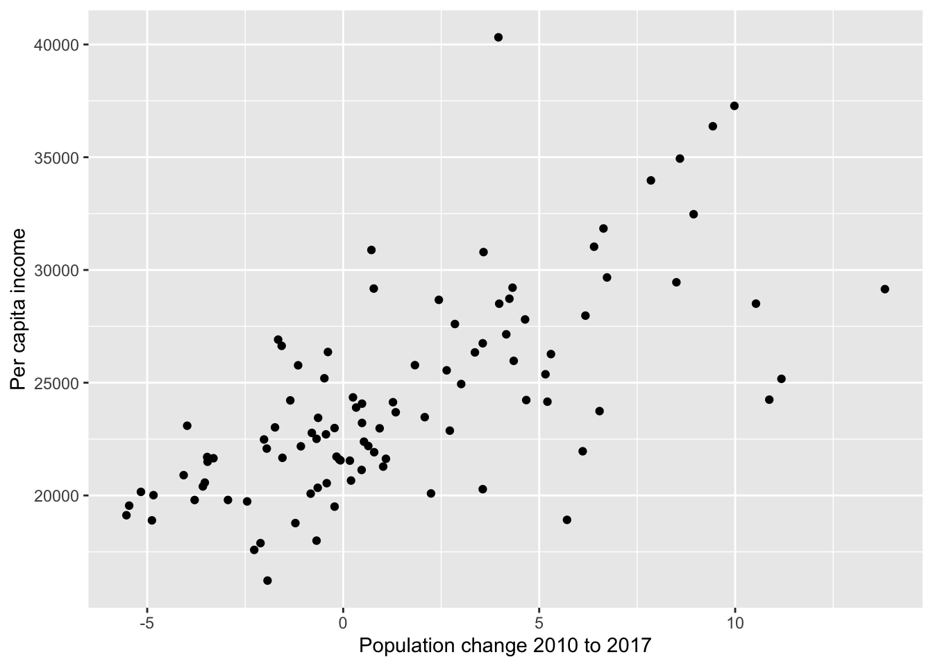
Below is graph of the relationship between population change from 2010 to 2017 and per capita (per person) income.
Code
ggplot(data = nc_counties, aes(x = pop_change, y = per_capita_income)) +geom_point() +labs(x ="Population change 2010 to 2017", y ="Per capita income")
TRUE or FALSE. More people moving to a county causes an increase in the income per person.
Types of variables
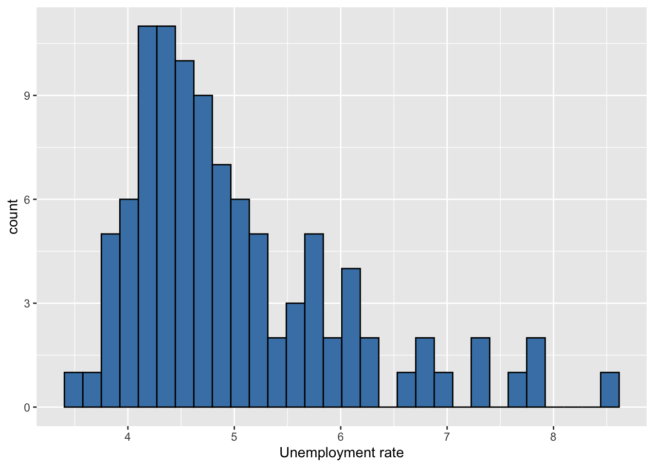
It’s important to know each variable’s type, because the type informs how we analyze the variable.
We describe the distribution of categorical variables using visualizations and a frequency table that contains the number and/or proportion of observations in each category.
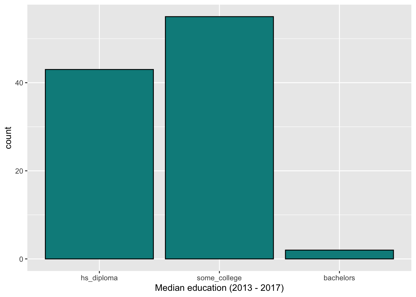
Below is a bar chart and frequency table showing the distribution of median_edu, the median education level (2013 - 2017):
What does it mean for an analysis to be “reproducible”?
Near-term goals
Are the tables and figures reproducible from the code and data?
Does the code actually do what you think it does?
In addition to what was done, is it clear why it was done?
Long-term goals:
Can the code be used for other data?
Can you extend the code to do other things?
R and RStudio
R:
R is an open-source statistical programming language
R is also an environment for statistical computing and graphics
It’s easily extensible with packages
RStudio:
RStudio is a convenient interface for R called an IDE (integrated development environment), e.g. “I write R code in the RStudio IDE”
RStudio is not a requirement for programming with R, but it’s very commonly used by R programmers and data scientists
R is like the engine of a car and RStudio is like the inside.
Packages
Packages are the fundamental units of reproducible R code. They include reusable R functions, the documentation that describes how to use them, and sample data
As of September 2020, there are over 16,000 R packages available on CRAN (the Comprehensive R Archive Network)
What can do most data analysis tasks using the tidyverse and tidymodels packages.
Click RStudio to log into the Docker container. You should now see the RStudio environment.
Tour of RStudio
Editor
Console
Environment
Files + Plots + Viewer
Quarto document (.qmd)
Fully reproducible reports – the analysis is run from the beginning each time you render
Code goes in chunks and narrative goes outside of chunks
Visual editor to make document editing experience similar to a word processor (Google docs, Word, Pages, etc.)
Can produce multiple types of document using the same Quarto file (e.g., websites, presentations, word documents, academic publications, etc.)
Tour of Quarto document
Go to File -> New File -> Quarto Document
YAML
Text
Output
Rendered document
Additional resources
The content in this document is based on the resources listed below. These are great resources for more in-depth discussion of today’s topics and for additional practice.